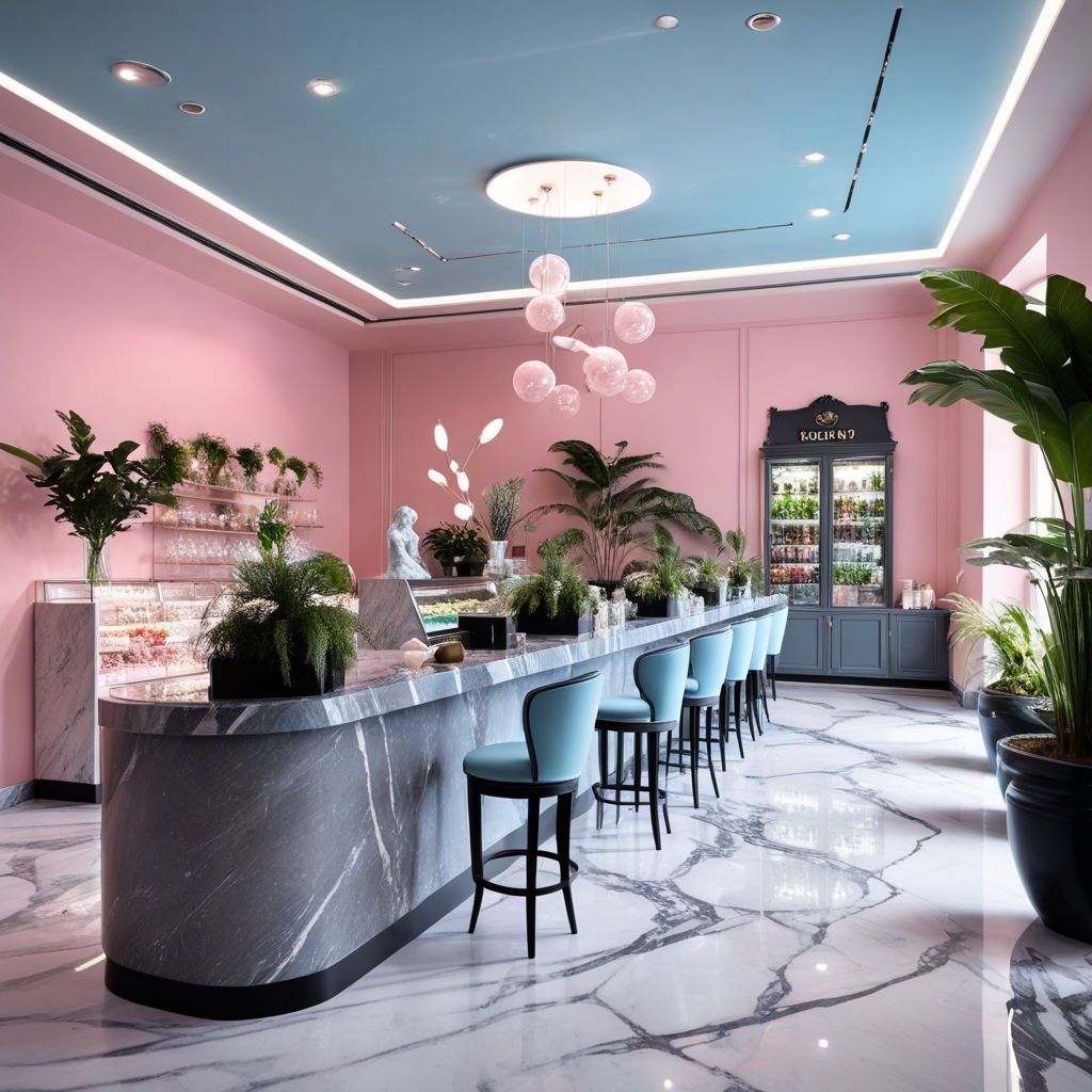
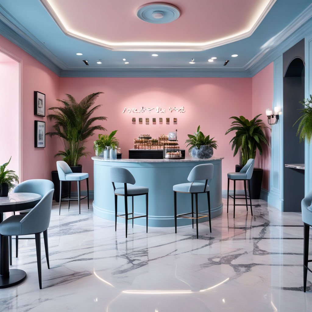
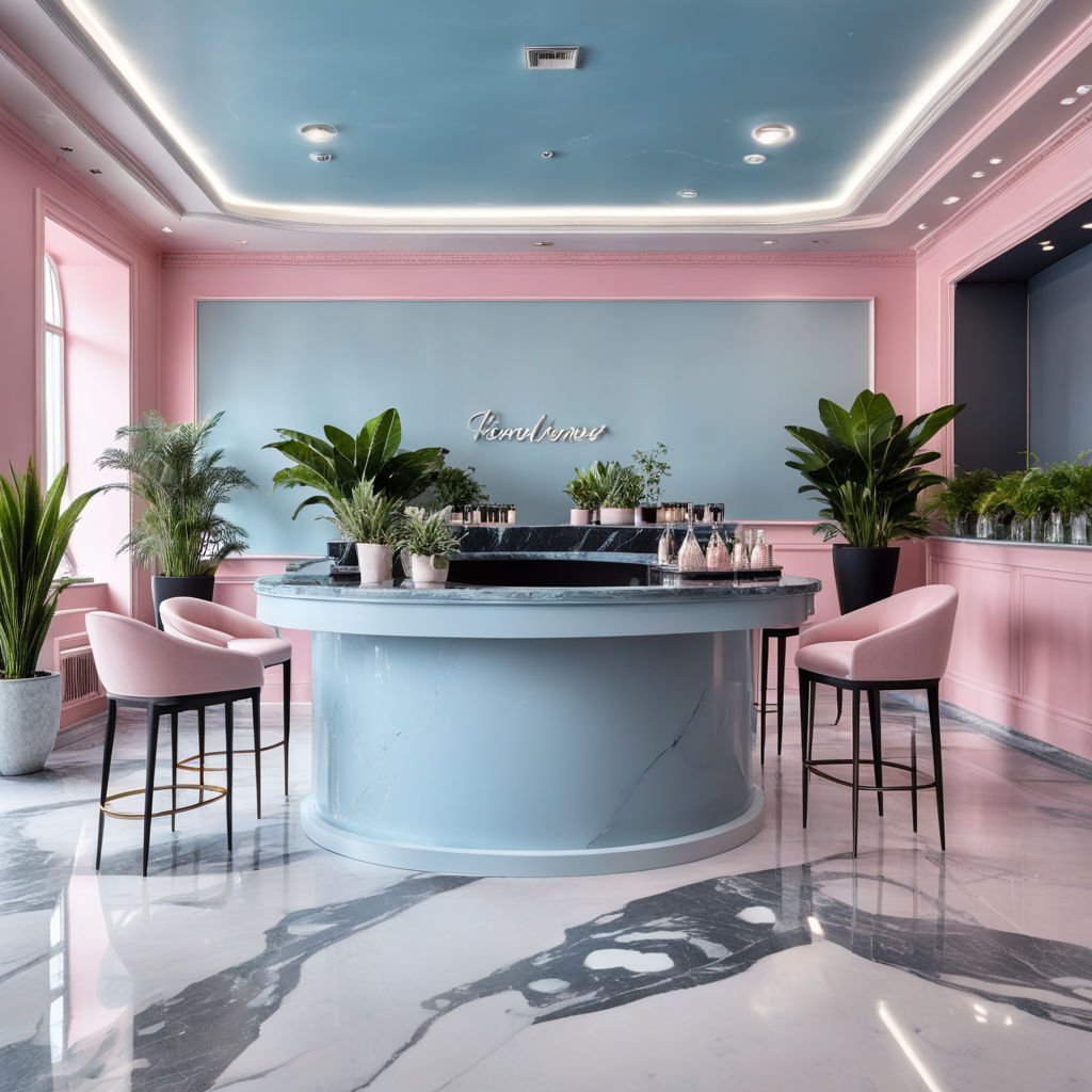
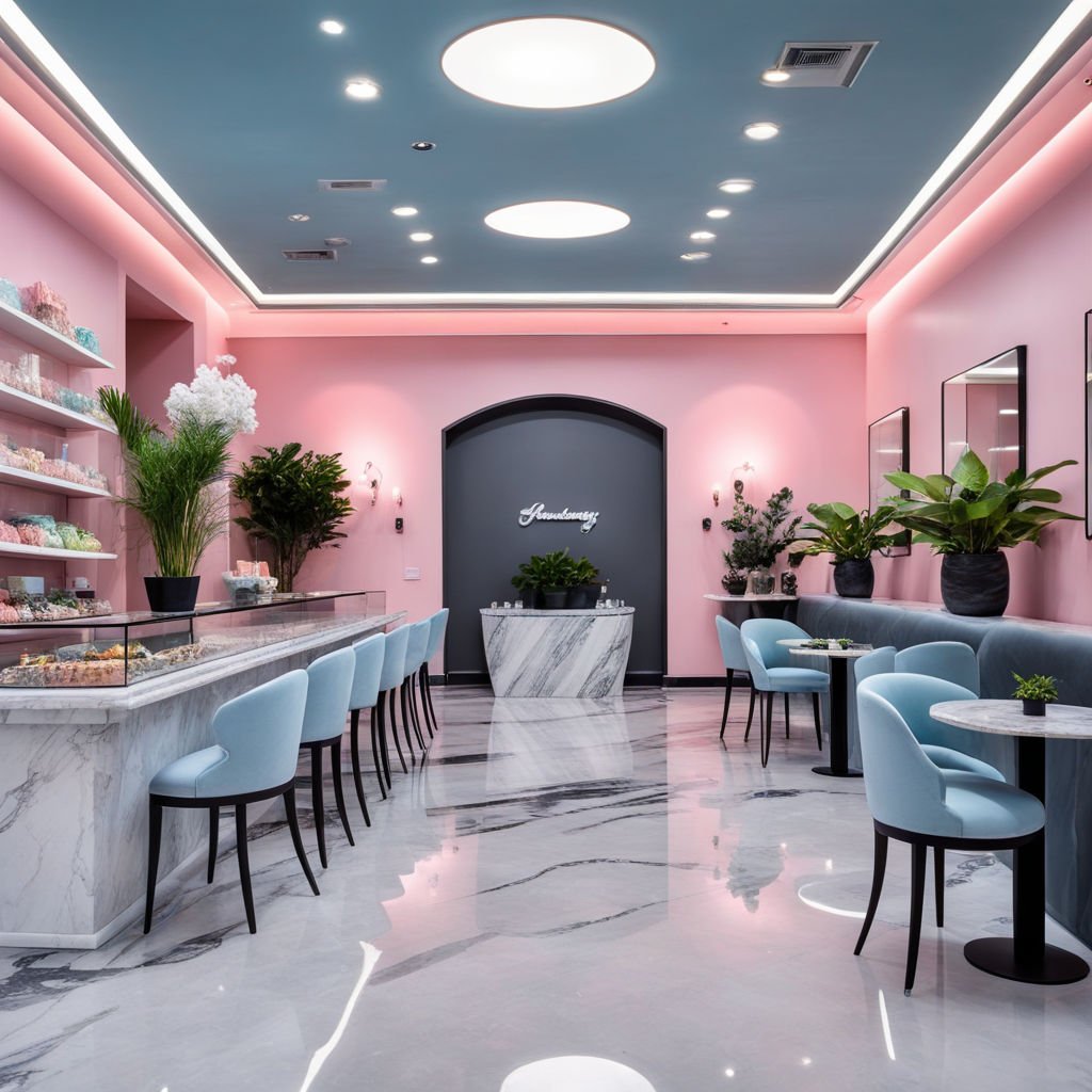
For this project, our client had a simple yet imaginative request—to infuse the space with two main colors, light blue and pink. From the start, we envisioned how these hues would delicately intertwine to craft an environment that felt like walking into a candy wonderland. Every corner of the store needed to evoke softness and joy, so we carefully balanced the colors, ensuring neither overwhelmed the space but instead created a seamless, harmonious blend.
The light blue gave the space a serene, airy feel, reminiscent of open skies, while the pink introduced a touch of sweetness and warmth. Together, they transformed the hall into a place where comfort and happiness were paramount, like the sensation of unwrapping your favorite candy.
But we didn’t stop there. To elevate the design and add depth, we introduced subtle pops of green through carefully placed plants. This small yet brought a sense of vibrancy and life to the space, enhancing the colorful palette while maintaining balance. The green touches added a natural contrast, making the environment feel even more playful, inviting clients to explore every nook with childlike wonder.
In essence, the store became more than just a space for sweets—it became a place where clients could feel like children again, free to enjoy and relive the carefree joys of youth. Each design choice worked together to ensure that the moment clients walked in, they felt a delightful, sensory experience, with colors and textures that were not just visually appealing but emotionally comforting.